
The Challenge

As the app’s slogan states it, “carry your next speech in your pocket”, the main idea behind this is that Cue Cards not only performs basic tasks, like any other paper cue card would do, but it also gives the user the ability to edit their presentation’s text on the go.

However, by creating an ecosystem of devices that aid the user beyond carrying content, Cue Cards could become the perfect assistant to help them improve their presentation and their delivery skills.

Duration:

3 months

Responsibilities:
  • UX Designer

The Result

Developing the App's Ecosystem

iPhone App

The testing session resulted in a list of action-items geared to improve the app’s current functionalities. Below there is a link to access the prototype of the revised version.

Dragon App by Nuance
Suggested Integration

The App Dragon by Nuance is a great way to turn dictation into content. By integrating it with Cue Cards, the user will be able to quickly turn thoughts into cards without a single key stroke.

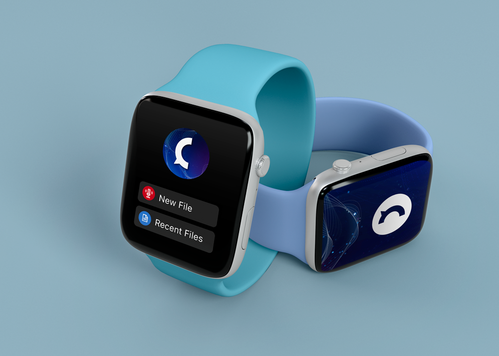
Apple Watch App

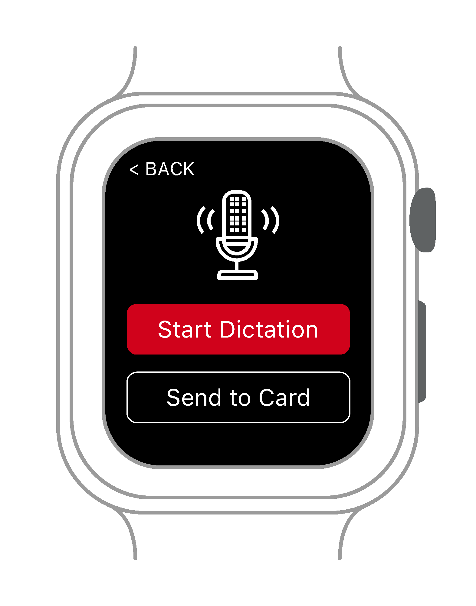
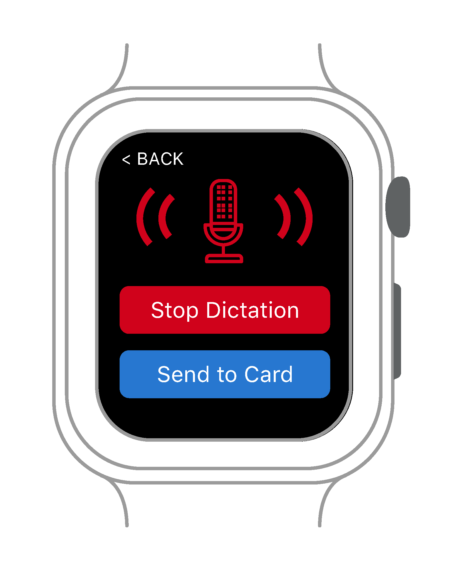
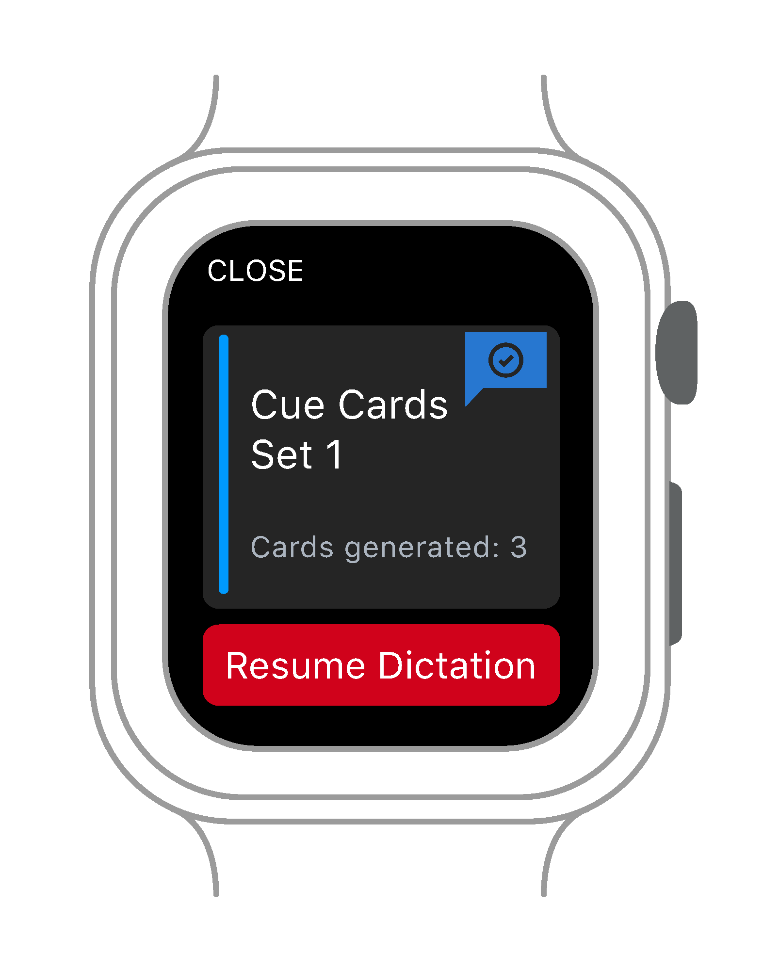
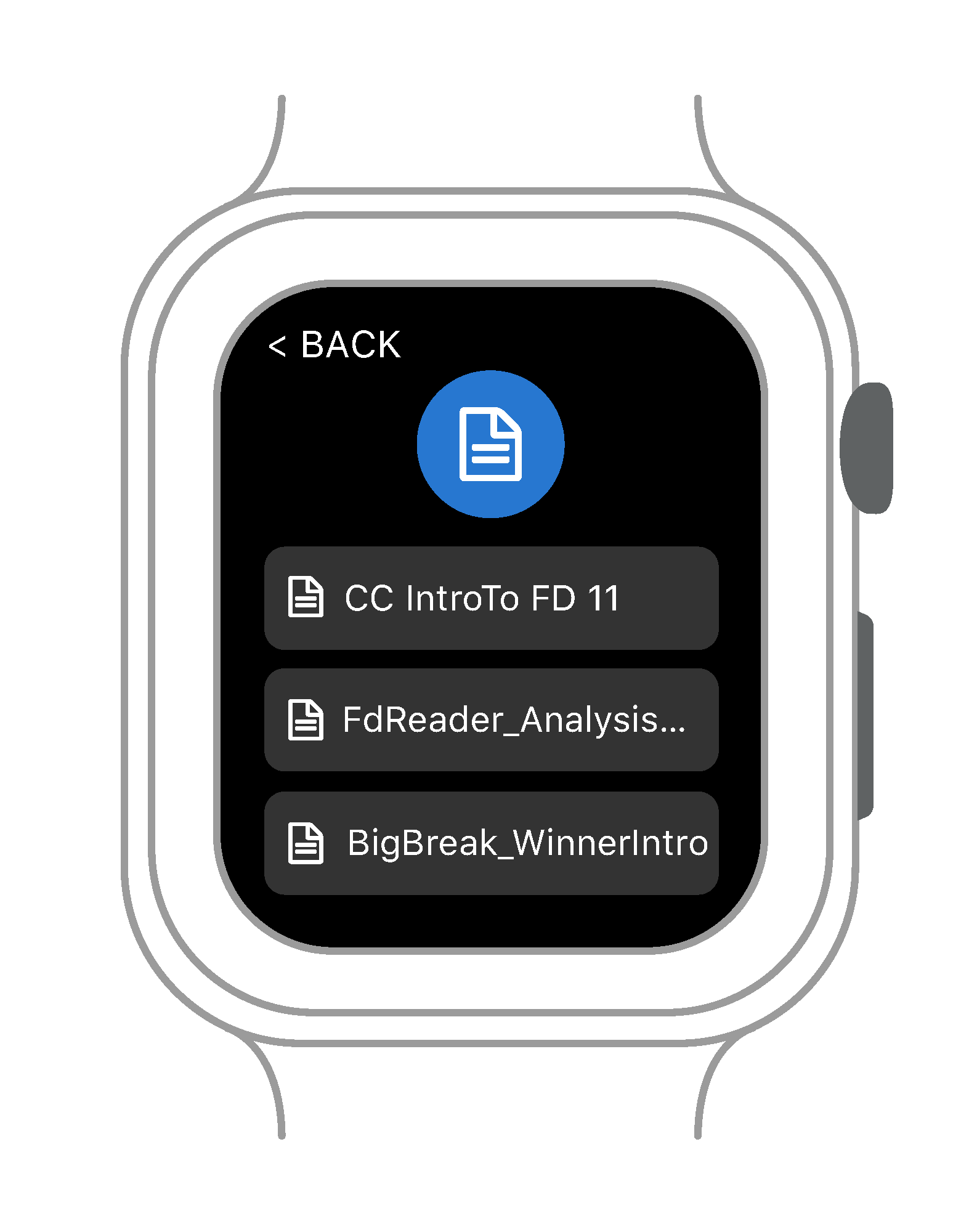
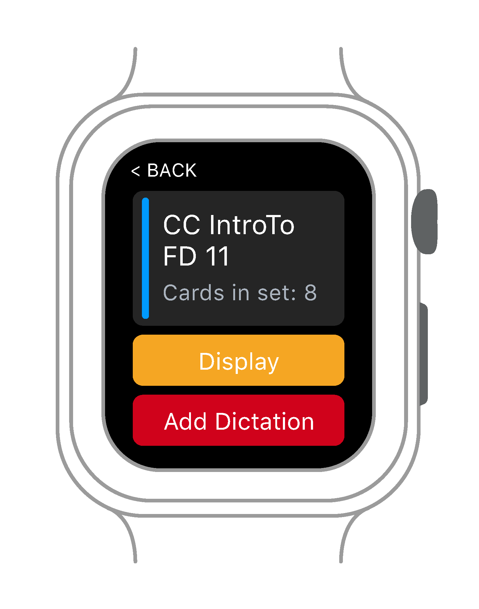
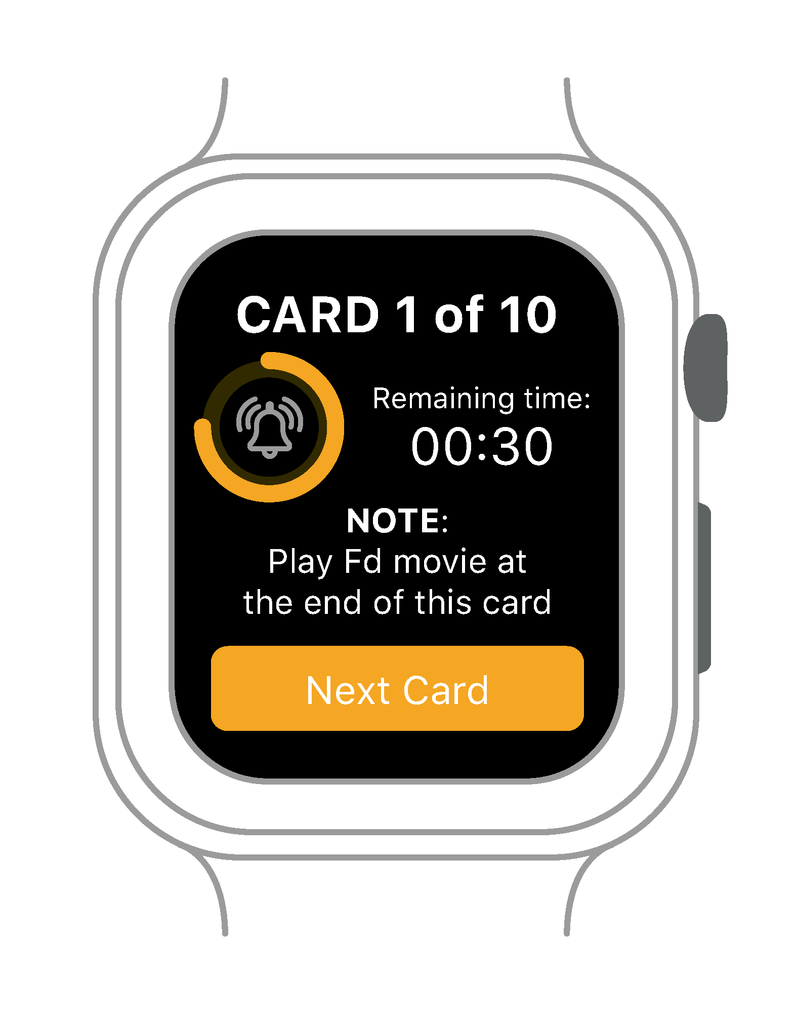
The main purpose of the Apple Watch App is to assist the user on two fronts:

  1. Prior to the presentation by aiding them to record content through dictation as well as taking notes for themselves about actions to take while presenting.
  2. During the presentation by alerting the user of the amount of time left for a specific portion of the presentation. Also reminding the user of any support material that is part of the presentation, such as a video.
Cue Cards App on Smart Phone
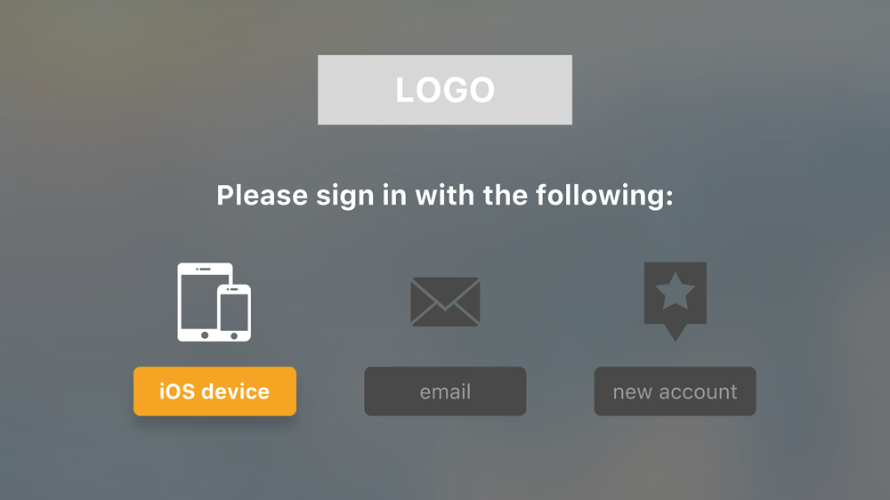
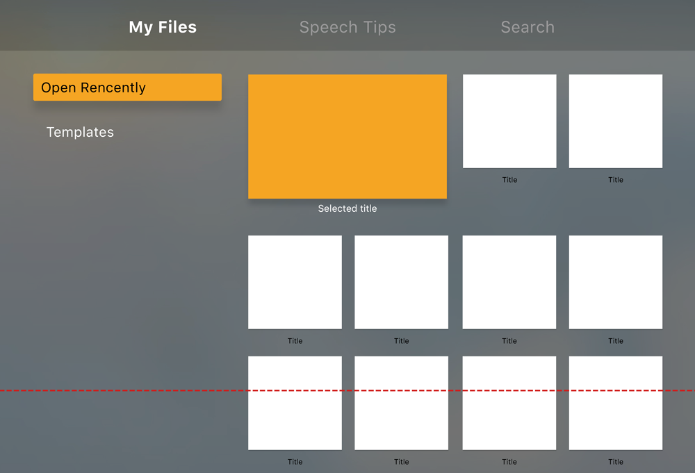
Smart TV App

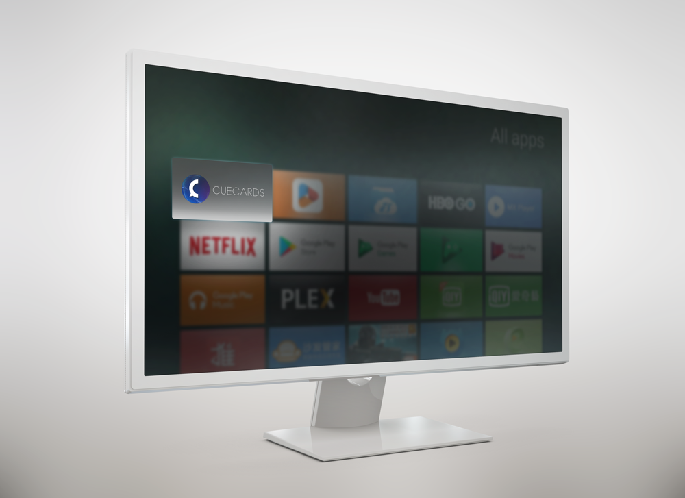
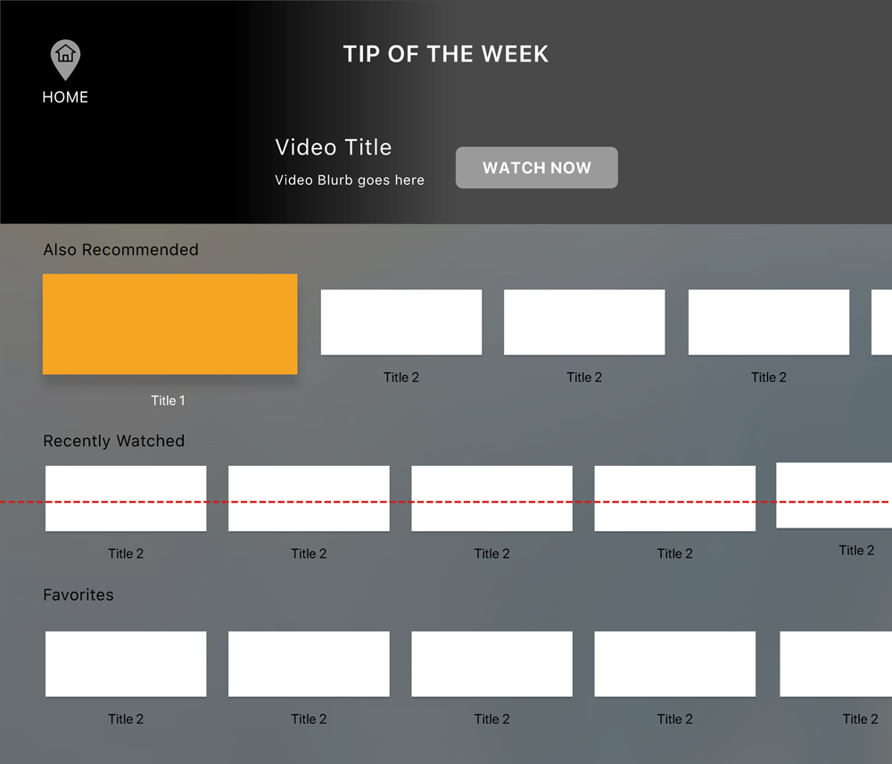
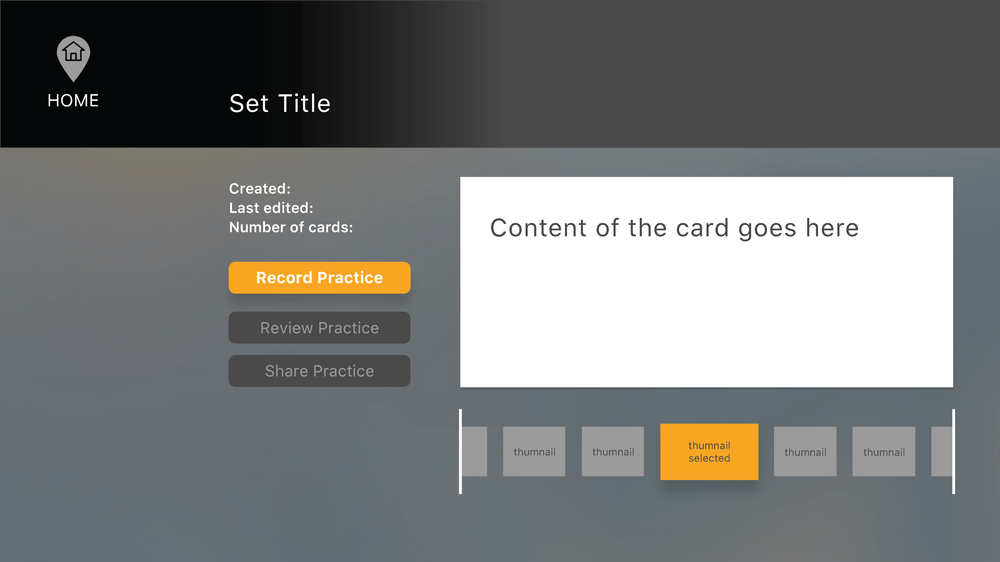
In addition to preview the cards’ content in a larger format, the TV app can help the user to improve their presentation skills. This would be achieved by:

  1. Using the TV’s camera, the App would record a rehearsal of the presentation for the user to review after and use Artificial Intelligence to give them suggestions on what could be improved (for instance having a better posture).
  2. Becoming a resource to help the user improve their presentation skills through a series of video lessons and exercises.
Cue Card App on Smart TV

The Process

The Application's Current Version

Cue Cards App Current State

The Proposed New Flows

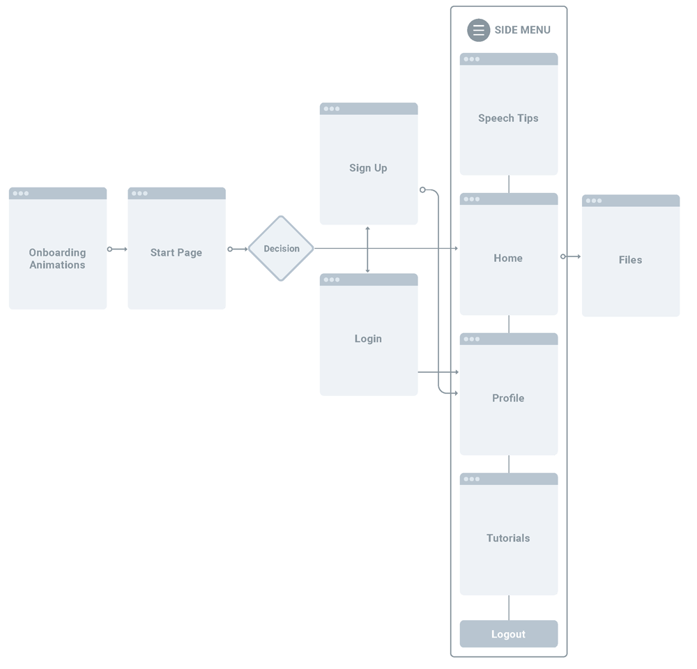
Main Flow
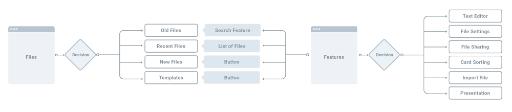
Editing File Flow
Editor Flow
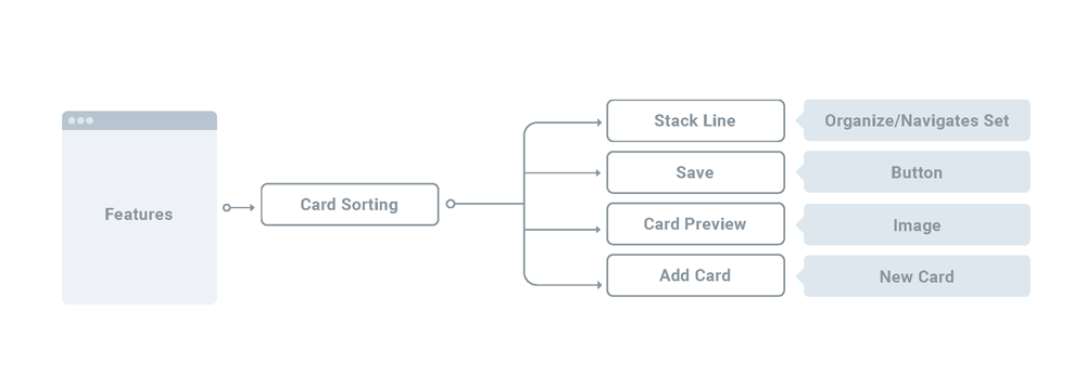
Card Sorting Flow
Feature Flow
Important Gestures
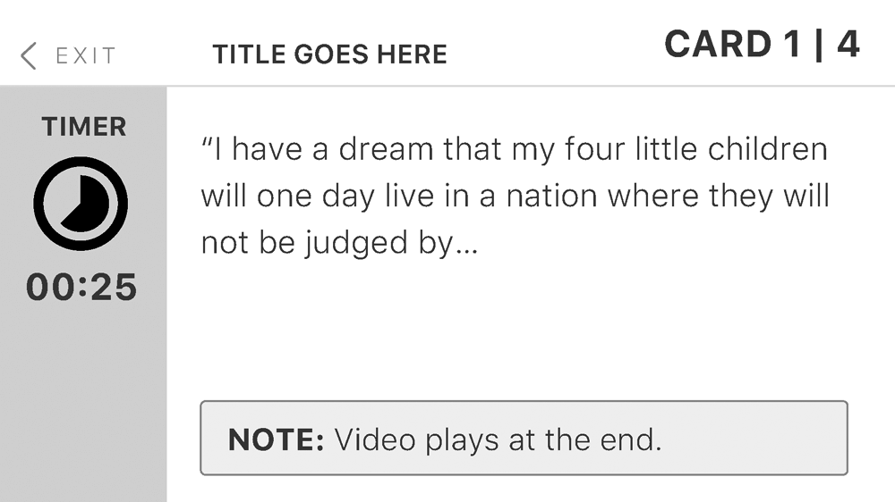
Swipe Left and Right
Swipe Left/Right

These gestures will help the user to navigate between cards during the editing process, as well as during the presentation.
Cue Cards - Next
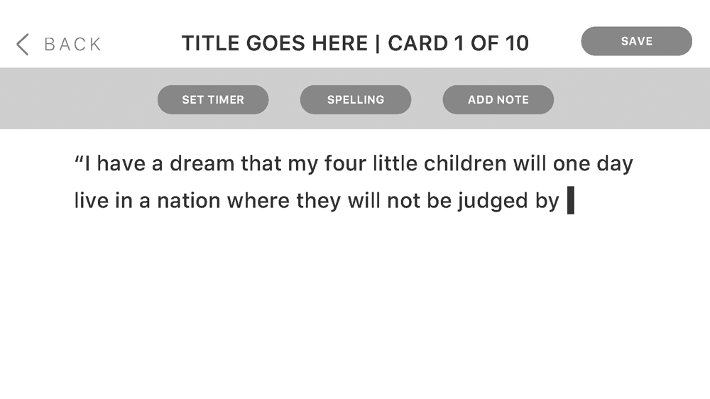
Swipe Up and Down
Swipe Up/Down

Since the space on a phone is limited, these gestures will help hide/reveal menus for editing the content.

Cue Cards - Menus
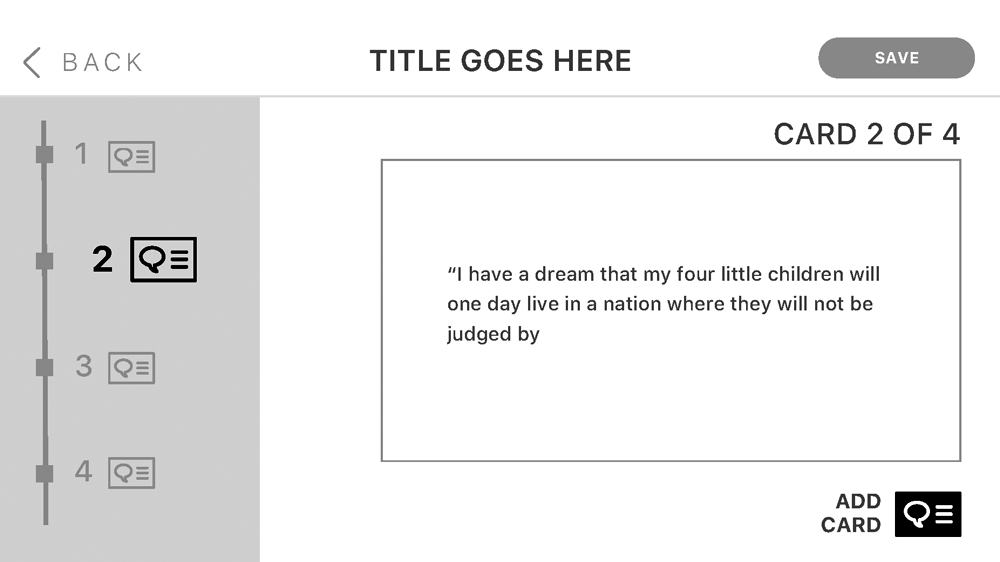
Hard Press and Drag
Hard Press & Drag

Through these gestures, the user can reorganize the timeline by selecting a specific card and relocate it somewhere else.
Cue Cards - Card Sorting

Project Evaluation

Initial Prototype

With all the initial screens completed, I proceeded to create a prototype to test the solution proposed. Below there is a link to that prototype.

The prototype in inVision might be hard to view on Desktop since the application doesn’t allow for different rotation of the screens within the same file. However, I was able to perform the test using the phone version of inVision, since it accurately emulates how the users would rotate the device when using the app.

User Testing Findings

Testing the prototype with 3 actual users was an eye-opening experience. After reviewing all the notes from the exercise, I developed a list of “pain points” that kept arising and turned them into a list of future action-items. The following will be the key points to tackle in the upcoming iteration of the prototype for the Cue Cards app:

  • Create an on-boarding process to teach the user, especially the new ones and less tech savvy, about how to use this app.
  • Re-organize the menu screen and incorporate items that will help the user to access recent files faster.
  • Re-organize the “content editor screen” and move some of the tools to other areas of the app, to avoid overwhelming the user.
  • Relabel the editing tools so the user understands what they are and their function intuitively.
  • Include visual cues to let the user know their current location within a set of cards during “display mode” as well as “editing mode”.
  • Include a section where the user can add notes for themselves that uses very little space, and it is easy to access.

The Take Aways

  • After reviewing the results of the prototype’s testing, the most relevant feedback came from the least technology savvy individuals, particularly in the areas of organization and language.
  • The biggest challenge from this project was having such limited space to work with. Some of the solutions proposed, such as having the user to type on the phone on landscape, ended up being discarded for future iterations. Even though they offer more space, they also were physically more strenuous for the user, because they are not used to accomplish that task in that way.