Nekter stores have a sole menu board that hangs over the service station. Customers who have trouble making a quick decision about their order may experience anxiety as they browse the menu. They also may feel rushed if there are other customers in queue.
Duration:
3 months
Responsibilities:
UI Designer
The Result
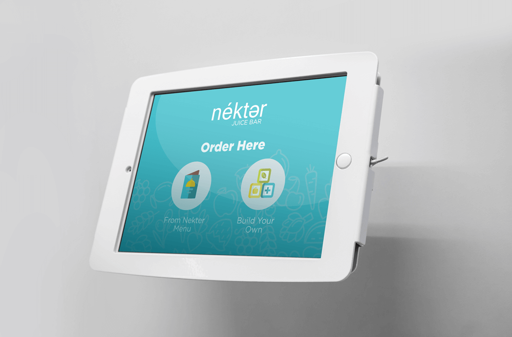
In-store Kiosk
Interface
Kiosk's Device
The Process
The Research
Understanding the Brand
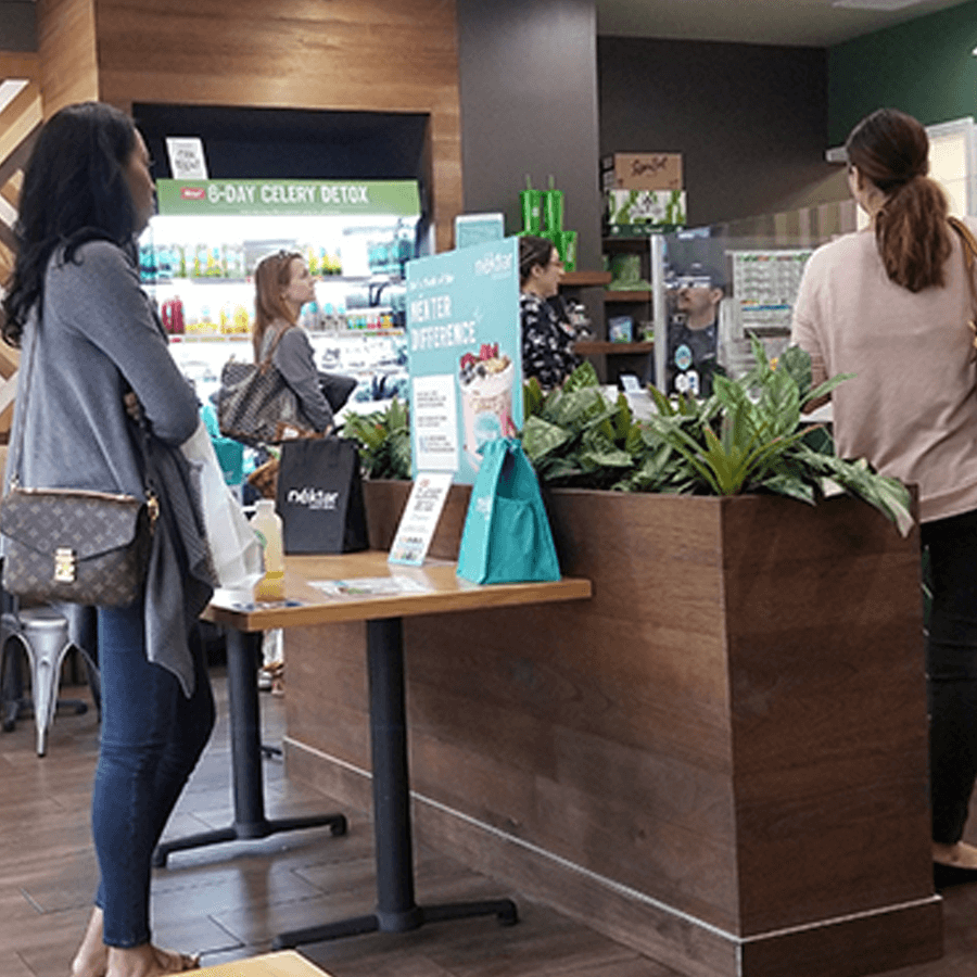
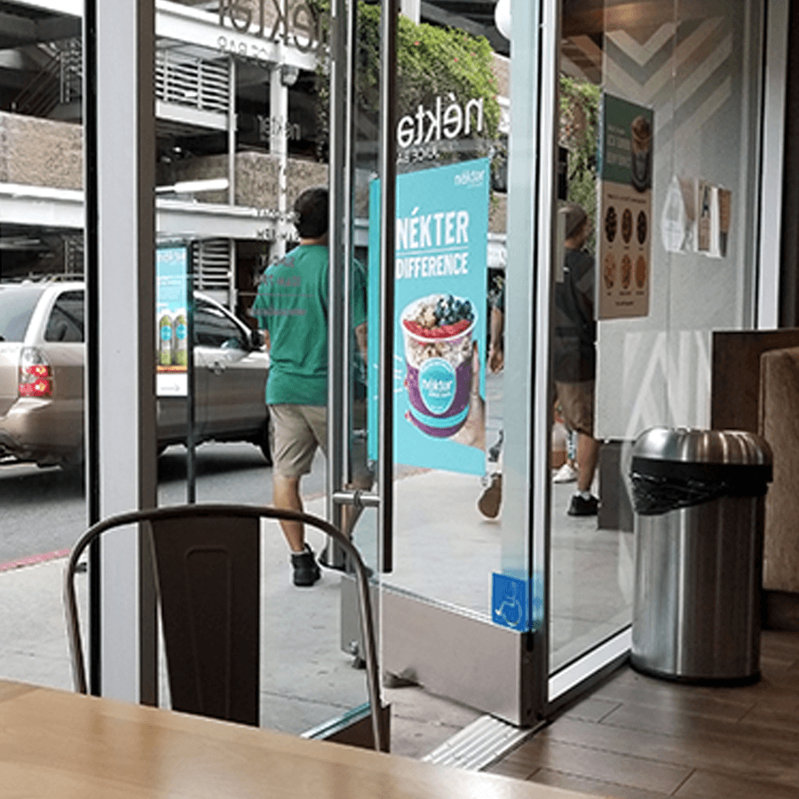
Visiting the Facilities
Customers at the store
Marketing outside the store
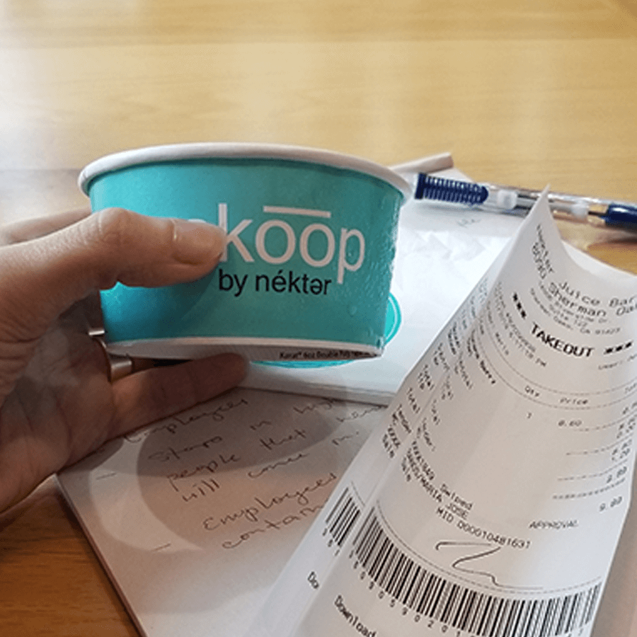
Product container and receipt
Crafting a User Story
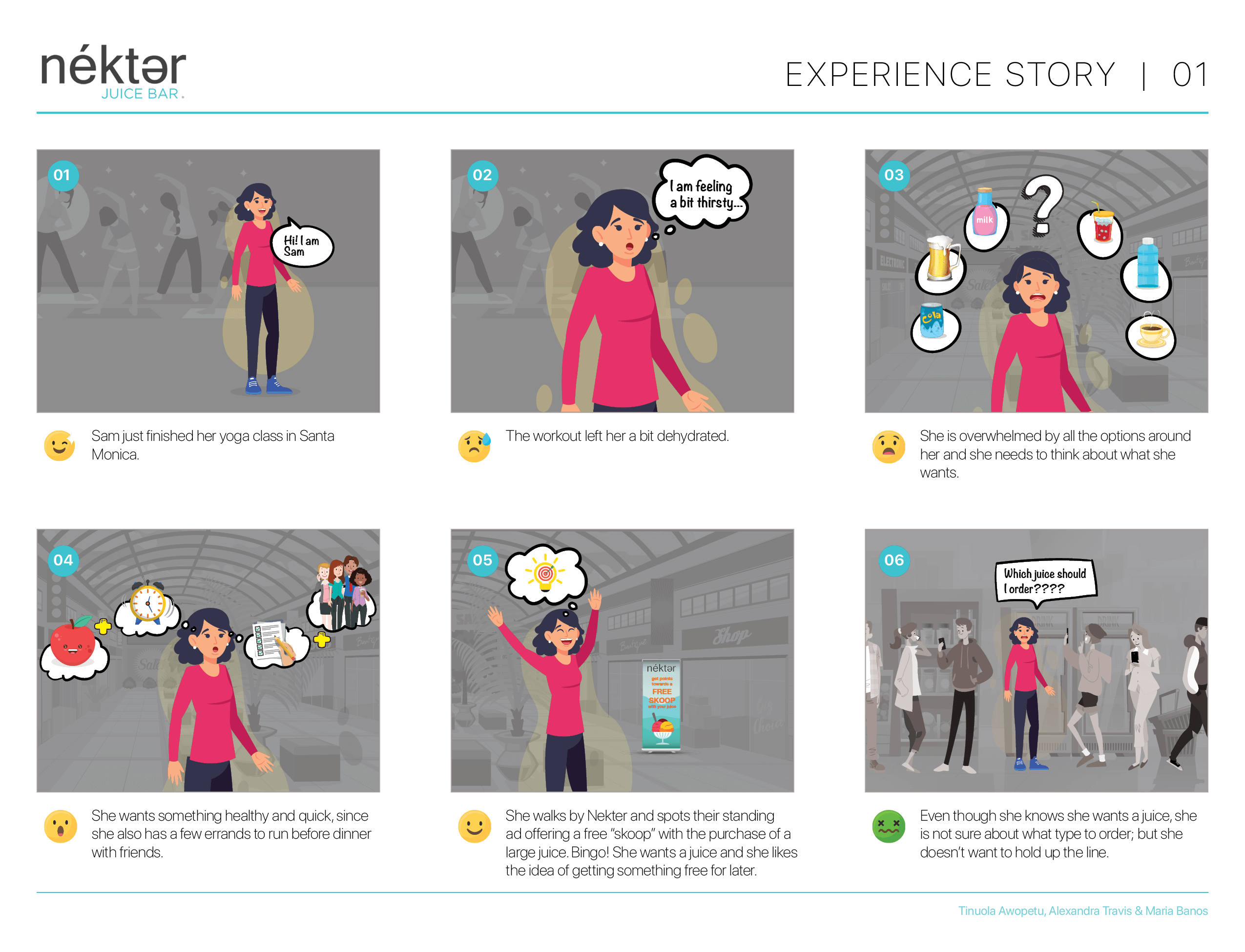
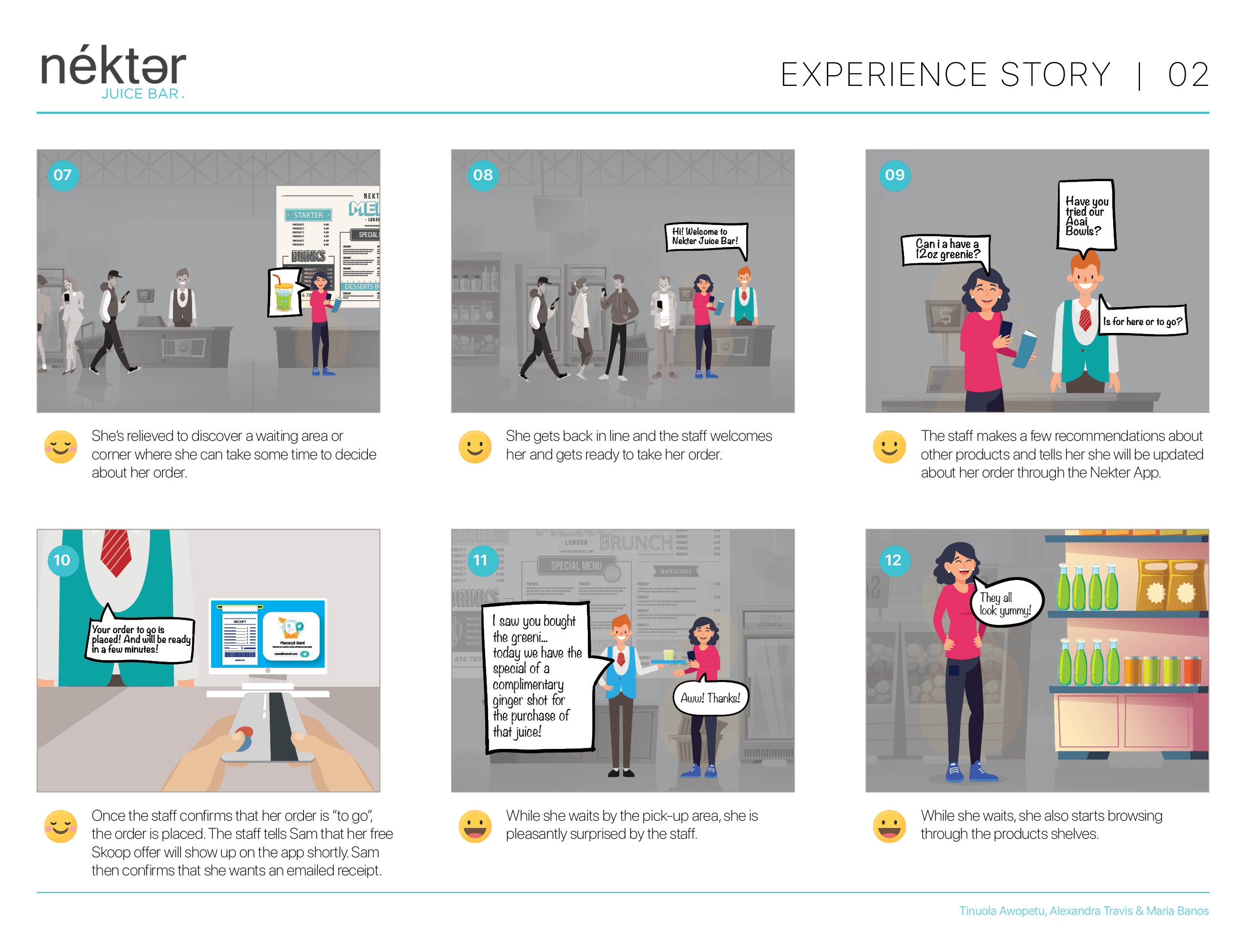
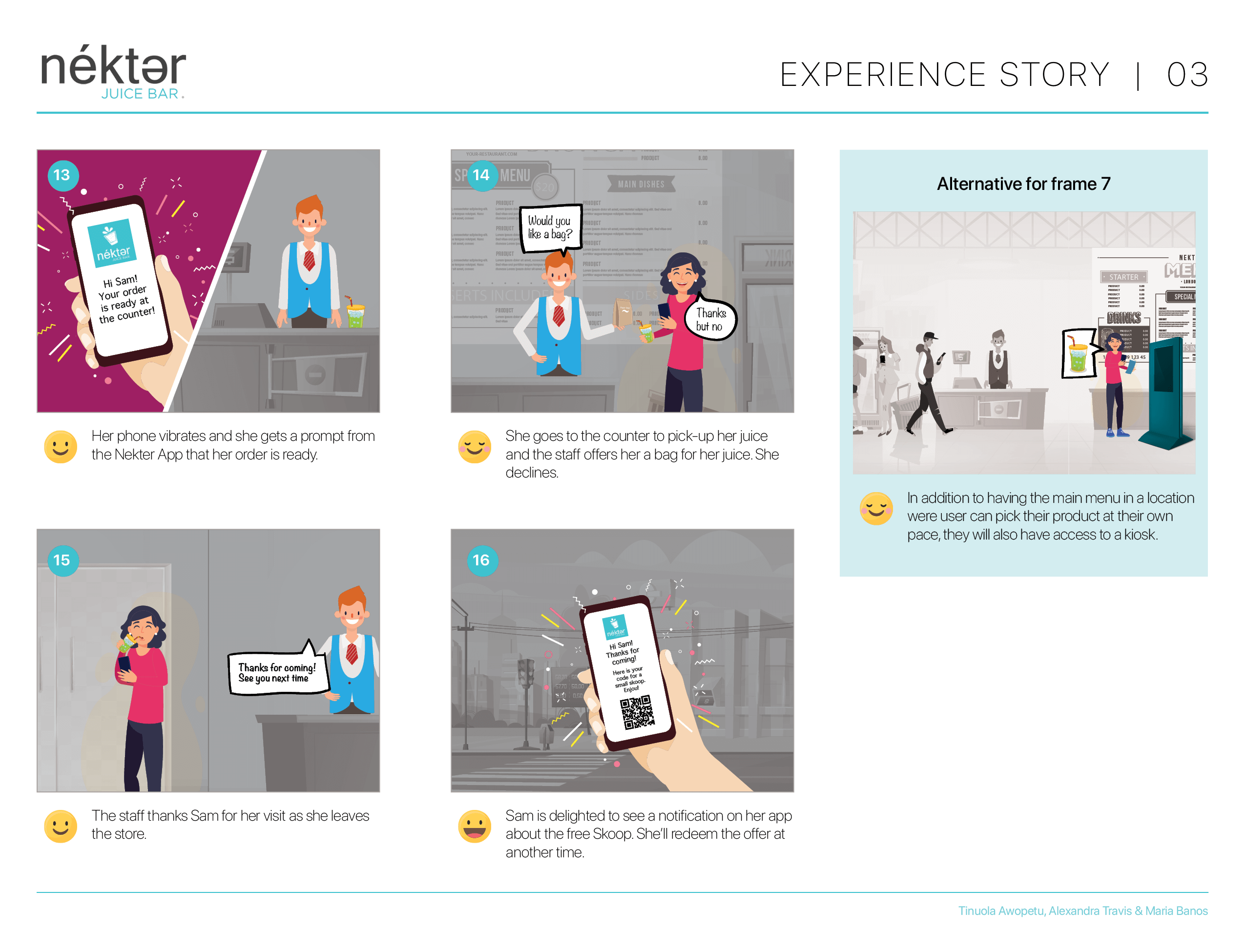
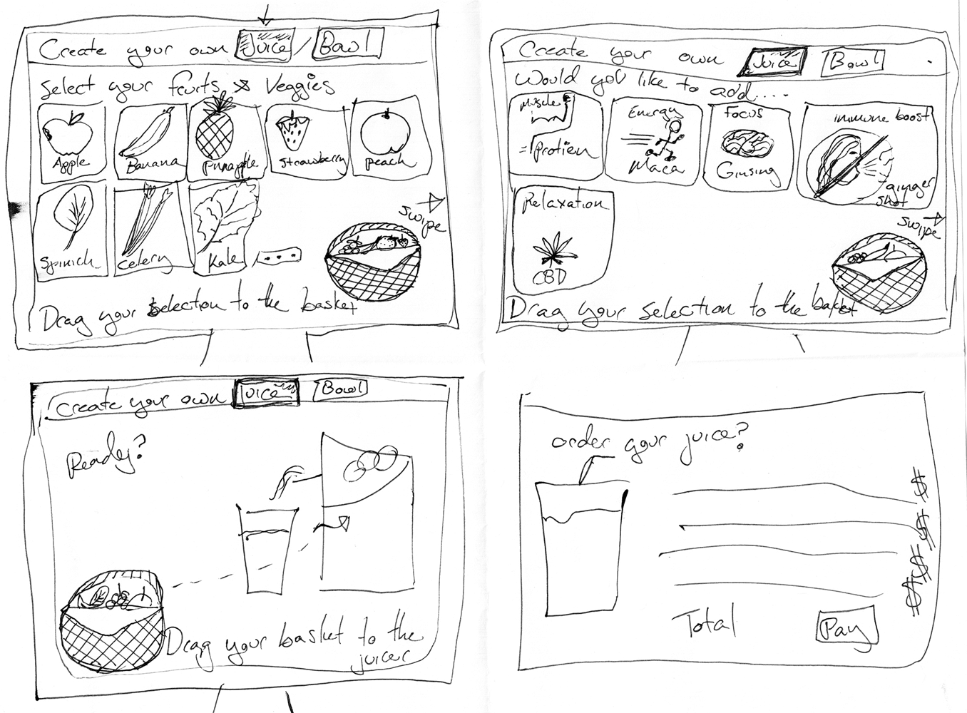
After visiting multiple stores and observing the customers’ behavior, patterns started to emerge, which led us to the story board shown below.
Once the evaluation our personal insights and storyboard was completed, we decided who that our primary user is a mother, looking to spend quality time with her child, while teaching him/her about healthy drinks and snacks.
When designing for a kiosk, the prototype and testing should include the physical platform too. In this case, the kiosk was changed from a standing platform to a tablet mounted on the wall with an adjustable arm. That change would accommodate users with some form of physical constraints such as someone with a broken arm, or a mother holding a baby or a person of shorter stature.
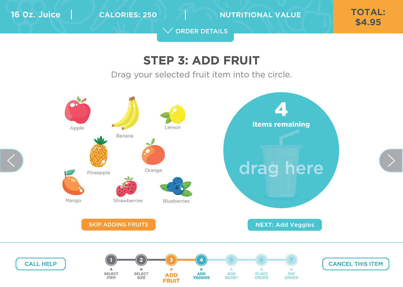
We also learned about how to strike a better balance between user’s objectives and sale’s objectives. By adding a point of friction prior to the toppings, we hindered the company’s prospects of making more profit on the purchase.